Showing posts with label Construction - Advertisement. Show all posts

Wednesday, 24 March 2010

Final Advertisement

After taking note of the feedback I recieved last week, I have produced my final design for a magazine advert.


I have included more action in the background with the inclusion of the musical notes, thus creating more effective synergy with the digipak. I have also taken a technique from Florence and the Machine's own advertisement and bordered the information of the release date. I have added a purple glow to the image of the artist so she blends in more with the background, while adding back the speech bubble from the first design to highlight the influence of comics.

Friday, 19 March 2010

Audience Feedback to the Advertisements

As mentioned in my previous post, I would be allowing friends, family and school peers to view my two designs of a magazine advertisement, promoting the debut album of the band Amber Rhythm. This task helped me to to decide which advert I would develop and then become my final design.


My results show that out of the fifteen people questioned, 9 preferred my second design to the first design, where only 6 people chose this.I then asked all of the candidates a range of questions on both design to gain the critical feedback I needed in order to develop the advertisement. These were:

  1. What aspects of the advertisement did you enjoy?
  2. What did you not enjoy about the advertisement?
  3. What would you improve on the advertisement?

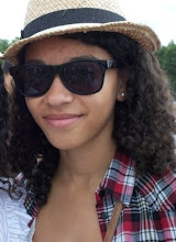
1. For the first question and the first design many of the candidates stated that they enjoyed the fact that the advertisement adhered to many of the conventions of magazine advertisements. They picked out "...the release date, shop retailer and information of what the album was released on very professionally done..." which only enhanced their enjoyment more. Secondly the image of the artist was picked up, and some candidates "...recognise this image from the album cover..." This showed that I successfully created a synergy between the two products and that it would be recognisable to the audience when viewed in a shop etc. The musical notes in the background were another popular idea with most of the candidates as it was used on the digipak cover but also because it links to the band's name but also their overall image in music. For my second design feedback on this included that this advert was the one that defined the link between itself and the digipak, "...although the image isn't from the front cover it is still included in the digipak and the background colour scheme is also the same making this the more effective poster..." The band's logo being placed in the center of the advertisement was said to be eye catching and authorative as to some this is the most important aspect to gain their attention. Another candidate stated that "...while the first design looked more pop/rock, I prefer the second design due to its simplicity, and that it isn't so "in your face". Also as the image of the artist is looking away, something that I picked up myself in Florence and the Machine's advertisement poster, means that "...there is an air of mystery to the band, but it looks like she is inviting you in "on the sly". Finally, the quoted reviews were enjoyed by most of the candidates as they felt it made the ad look more professional but also it adhered to conventions of an advertisement.

2. Aspects of the first design many candidates didn't enjoy were that the colour scheme was too dark and "...wouldn't catch my eye unlike a brighter colour in the background..." The fact that it did not carry any synergy with the digipak turned off one or two candidates as well. The speech bubble was said to be a good idea as it made the poster look a lot more fun, but not much was done with it and it seemed to "float" there without doing much. For the second advertisement, while some liked the simplicity, others felt that it was too plain and there needed to be "...more action in the background like the first design..." Others noted that they thought the image of the girl was good in its effect, but she seemed to be floating in anymonity, which wouldn't be appealing to an audience. One person told me they would of liked to have seen the speech bubble replicated in the second design as they felt the logo again was just "floating". One other candidate said that the website for the band's font was far too small, and it is "...an important factor when advertising so it should be made much bigger for audience members to pick up on..."

3. For the third and final question I only asked what could be improved for the second design as it was the more popular. Points that were stated included improving the background scenery more, by taking the technique from the first design and importing the musical notes onto the second to "...jazz it up..." but to also enhance the genre of Pop/Rock. Also a few pointed out that the image of the artist should blend in more, rather than just floating anoymously. The website font should be made bigger as said in the last question.

Taking on board what has been said in this feedback I will make more developments to my second design in order to improve it further.

Monday, 15 March 2010

Second Draft of Magazine Advertisement

I have designed a second draft of my own magazine advertisement. I will then present the two completed advertisements to friends, family and peers on which one they prefer, receiving positive as well as negative criticism from their feedback. This will then help me to decide which one will be my final product.

My reasons for this design were:

  • The purple striped colour scheme correlates with the colour scheme on the digipak, therefore creating synergy between the two products. This colour of purple is not too dark but not too bright, rather somewhere inbetween conforming to the audiences insight of what a pop/rock advertisement look like.
  • I have used a different image from the one I used on my first design. This image is included in my digipak however, on the inside covers. So although it may not be entirely recognisable to an audience, it is still creating synergy between the two products. I have applied the cartoon affect to this image, as explained previously to highlight the comic book influences for the band and myself.
  • The layout itself is very simple. Again I haven't tried to pack the advertisement with a lot of information to put off an audience. It includes the important info of release date, outlet and website. But on this design I have included quotes of reviews from respectable music magazines. Not only does this create a synergy between the magazine and the advert, but it allows a new audience an insight into what people think of the band's music.
  • The logo of the band has been placed at the center of the poster and I have removed the speech bubble to make the effect a lot more simpler. It is instantly recognisable to fans.

Thursday, 11 March 2010

First Draft of Magazine Advertisement

After my initial decisions, I have created a magazine advert of my own following conventions of traditional advertisements, while trying to reflect my genre of Pop/Rock. I will explain my choices for this design below.

  • Firstly I chose the image on the front of this advertisement as it correlates with the digipak's image and creates synergy between the two products. The speech bubble is a brand new image however, and although I wanted to originally use it on my digipak cover, I didn't and so I felt this would of been a good opportunity to use it here. It ties in with the comic book theme that predominantly runs through the video, digipak and now the advertisement.

  • The band's logo has been included to make the advertisement recognisable to an audience.

  • The background design is different to the digipak, something that challenges the conventions of an advertisement. I wanted to use a different colour purple as the magazine adverts I looked at for our genre used a darker colour.

  • The font style is the same as the digipak's. This again creates synergy between the digipak and advertisement. It is the band's "signature" font making it recongisable too.

  • The musical notes make an appearence here just as they do on the digipak. The musical notes are intended to be a part of the band's logo due to the name and so they felt appropriate here

  • The information is structured and clear with not too much packed into the advertisement, making it simple enough to read.

Monday, 8 March 2010

Ideas for my own Advertisement

After looking at other magazine adverts such as Jamie T's Kings & Queens and Blur, I have come to some final decisions about my own magazine advert. These were:

  • It was clear that with some of the magazine adverts I researched, I discovered that many if not most use the same image and background from their album cover for the advertisement. I intend to replicate this technique myself in order to create a synergy between both products.
  • I will use the same font used on the digipak. This makes the style recognisable to the audience, as well as using the same logo for the band.
  • Something that I didn't manage to incorporate onto my digipak but wanted to originally was to use a speech bubble that would reflect the conventions of cartoons and comics, a theme running throughout the music video and digipak.
  • Jamie T's advertisement did not seem too overpacked with images and was rather much more simplistic but effective. This is another technique I want to include on my own design.
  • The information on these adverts was also quite sparse and so I wish to only include the release date, title and where it can be brought, as well as a website for the band.