Wednesday 28 April 2010
What did you learn from Audience Feedback - Video
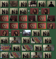
We asked our audience for feedback after a viewing of our music video for "Superman". A range of questions were asked from what they liked about the video, to what they didn't like about it and their overall view. The answers we gained were similar from the participants involved but insightful nonetheless. We have condensed their answers into these two videos.
Wednesday 21 April 2010
Final Blog Post!
My blog has finally been completed! I hope you enjoy looking through my various posts to gain an insight on my ideas and final designs, as well as influences and research that were important throughout all the tasks.
Here is our final music video for your enjoyment,
ENJOY! :)
Here is our final music video for your enjoyment,
ENJOY! :)
Friday 16 April 2010
How did you use media technologies in the construction and research, planning and evaluation stages?
Throughout the research and planning stages to the construction of my music video, digipak and advert I have used different forms of media technologies such as Youtube, iMovie, and photoshop for the construction. of these products.
During the research and planning stages, I found YouTube a very useful resource in aiding my ideas into my own music video. Watching videos from a similar genre allowed me to pick up the conventions of the pop/rock genre and later on in the evaluation stages I was able to highlight where I used, developed and challenged these conventions. Instead of watching a music channel on TV that would not always show the specific genre I was researching, YouTube allowed me to specifically search and select what I needed. Pausing the videos meant I could analyse and go back and view over multiple times. Google Images and Google itself was useful in the research and planning stages of my digipak and advert, as I had an essential range of examples to search for. It was particulary vital for researching into directors of music videos and artists of the pop/rock genre of our music video and I had a rich amount of information at my fingertips at all times.
When constructing our music video we had access to a video camera and tripod at our sixth form. The tripod allowed us to use tracking shots, and steady long shots while the camera allowed for zoom ins and close ups. iMovie was then used to upload our footage onto and then to finally edit. Throughout this process, our work was backed up to an external hard drive, but unfortunately there was a problem with this as at the middle stages of editing, we lost a majority of our edited footage and had to start from scratch. Nonetheless, the rest of the experience was pleasant enough, and we used YouTube clips for tips on effects and cropping as the software was updated and therefore brand new to the production team. Photoshop was used for the majority of the construction of my digipak and advert. The ability to crop images, add effects and use different fonts and tools was a great help in making the products look as professionally done as possible. Using it during the planning stages meant I could create a draft for a certain product and then ask for essential audience feedback, before moving on to develop a final design.
How effective is the combination of your advertisement, digipak and music video?
In order to create synergy between the music video, digipak and advertisement, creating the latter two with similar imager, techniques and fonts was essential in creating a familiarity for the audience while easily relating the three products to each other. My final designs for the digipak and advertisement are below.


Firstly the image of the female artist in the digipak and magazine advertisement are identical. While the image used for the advert is not the cover's main image it is still used in the production and I felt myself it was a more effective image to draw attention to the advert itself. However, it still allows the audience to make a direct link between the two products. The strong female image is also present in our music video. The female protagonist, while used in other music videos as demeaning and weak, was strong and in control of her own decisions in our own video, challenging the female stereotype. She was the character to take control and choose who she wanted to date, the plot/narrative of the video itself. As the image on the digipak and the advertisement are (mostly) a full body shot, this may attract a male gaze so in some ways this hindered the stereotype challenge.
The cartoon effected images and the thought bubble/speech bubble from the digipak and advert reflected our editing techniques from the music video for "Superman". Using this effect for the Superman character and the female protoganist's imagination highlighted the cartoonish, youthful effect we wanted to establish in the video. I myself developed this idea further in my digipak and advert to create a recognisable theme for the band. The logo was created using the graffiti tool, emphasising the youthful aspect of the three products. The music video uses scenes of childish play in the park. The theme of love is used for all three products. The digipak and advertisement emphasise the band's love of music with the image of the heart incorportated onto the image of the female. This theme was also the main plot to our video, the female character on her mission to find love at a speed date. I produced a red glow around the heart, while in our video to emphasise the theme we used the romantic effect to add to the speed dating scenes.
I used the segoe script font for both the advert and digipak to create a signature style for the band, but to also again emphasise the synergy between the products. Although no font was utilised in the video, it reflected the genre of Pop/Rock with its "real handwriting" effect, as well as being a popular choice with my audience. The glow effect used around the images of the female adds to the surrealness of the album, but again creates a synergy between the products. It also ties in with the theme of Superman from the video, and also one specific editing technique where we used the dream effect to reflect the excitement and surrealness of the imagination of our protagonist.
Overall, I feel the combination of the digipak, advert and music video are effective due to the carefully selected characteristics in all three products, which in turn creates an effective synergy and a personal image that fans would instantly recognise. Some features are more obvious such as the colour scheme and logo from the digipak and advert, with the Superman/cartoon-related connotations/ influences becoming obvious once the music video is viewed.
Saturday 27 March 2010
In what ways does your advertisement use, develop or challenge forms and conventions?
 As stated previously, in order to gain inspiration and ideas into the design of my own advertisement I researched into the conventions, the main ingredients, included in the production of a successful magazine advertisement. The most important conventions such as the release date and outlet retailer were present in all of the advertisements I came across, while I also specifically looked at advertisements that highlighted the conventions of my own genre of Pop/Rock. Therefore in my own production of my design, there were stages where I have used, developed and challenged the conventions and I will highlight these here.
Used
The main conventions that I incorporated into my own design included vitally the name of the band/artist. By using the same logo that was used on my digipak design thus creating synergy, it also promotes the band/artist and their profile in the public eye. Using details of the band's website promotes them further, allowing people to research them at their own leisure while allowing their own fans to be in contact with them with information like tour dates. The release date is a vital ingredient for an advertisement for the obvious reason of informing others when to buy it. It also creates an anticipation for their fans, counting down the days until its release. Stating the name of the retailer on the advert, while not seen as essential can be important in the album's release. As my own design states, the album is only available at HMV. This has been the case with some release posters I have seen in my own experience and so I incorporated that idea here. Using the similar background from the digipak creates a synergy between the two products and will be recognisable to fans when the digipak is brought in the shop.
Developed
As mentioned before, using the name of the retailer on the advertisement is not something necessarily used in the production of this product. However I chose to develop the technique here myself, and used the HMV logo with the slogo "available only at..." This informs the audience while promoting the retailer too. The image of the artist looking away from the audience does not seem conventional in itself and is rather rare as normally looking at the audience engages them immediately. However, with influence from Florence and the Machine's own advertisement, I used this particular image to make the artist more mysterious while slyly inviting the audience in. Additionally, the quotes from magazine reviewers I found in my research to be quite rare. However I developed the idea here, using two quotes from Q and NME magazine, showing to the audience that the band has been approved by the "experts".
Challenged
When looking at my design, I do not feel I challenged many conventions drastically as this would maybe divert the audiences attention elsewhere. However it could be said that I haven't conventionally used the album's main image for the advertisement as many traditionally do. The exclusion of the form of the album i.e available in digipak was due to their being no room left for this information, making the design appear too full and confusing.
Wednesday 24 March 2010
Final Advertisement
After taking note of the feedback I recieved last week, I have produced my final design for a magazine advert.

I have included more action in the background with the inclusion of the musical notes, thus creating more effective synergy with the digipak. I have also taken a technique from Florence and the Machine's own advertisement and bordered the information of the release date. I have added a purple glow to the image of the artist so she blends in more with the background, while adding back the speech bubble from the first design to highlight the influence of comics.
Friday 19 March 2010
Audience Feedback to the Advertisements
As mentioned in my previous post, I would be allowing friends, family and school peers to view my two designs of a magazine advertisement, promoting the debut album of the band Amber Rhythm. This task helped me to to decide which advert I would develop and then become my final design.
 My results show that out of the fifteen people questioned, 9 preferred my second design to the first design, where only 6 people chose this.I then asked all of the candidates a range of questions on both design to gain the critical feedback I needed in order to develop the advertisement. These were:
- What aspects of the advertisement did you enjoy?
- What did you not enjoy about the advertisement?
- What would you improve on the advertisement?
1. For the first question and the first design many of the candidates stated that they enjoyed the fact that the advertisement adhered to many of the conventions of magazine advertisements. They picked out "...the release date, shop retailer and information of what the album was released on very professionally done..." which only enhanced their enjoyment more. Secondly the image of the artist was picked up, and some candidates "...recognise this image from the album cover..." This showed that I successfully created a synergy between the two products and that it would be recognisable to the audience when viewed in a shop etc. The musical notes in the background were another popular idea with most of the candidates as it was used on the digipak cover but also because it links to the band's name but also their overall image in music. For my second design feedback on this included that this advert was the one that defined the link between itself and the digipak, "...although the image isn't from the front cover it is still included in the digipak and the background colour scheme is also the same making this the more effective poster..." The band's logo being placed in the center of the advertisement was said to be eye catching and authorative as to some this is the most important aspect to gain their attention. Another candidate stated that "...while the first design looked more pop/rock, I prefer the second design due to its simplicity, and that it isn't so "in your face". Also as the image of the artist is looking away, something that I picked up myself in Florence and the Machine's advertisement poster, means that "...there is an air of mystery to the band, but it looks like she is inviting you in "on the sly". Finally, the quoted reviews were enjoyed by most of the candidates as they felt it made the ad look more professional but also it adhered to conventions of an advertisement.
2. Aspects of the first design many candidates didn't enjoy were that the colour scheme was too dark and "...wouldn't catch my eye unlike a brighter colour in the background..." The fact that it did not carry any synergy with the digipak turned off one or two candidates as well. The speech bubble was said to be a good idea as it made the poster look a lot more fun, but not much was done with it and it seemed to "float" there without doing much. For the second advertisement, while some liked the simplicity, others felt that it was too plain and there needed to be "...more action in the background like the first design..." Others noted that they thought the image of the girl was good in its effect, but she seemed to be floating in anymonity, which wouldn't be appealing to an audience. One person told me they would of liked to have seen the speech bubble replicated in the second design as they felt the logo again was just "floating". One other candidate said that the website for the band's font was far too small, and it is "...an important factor when advertising so it should be made much bigger for audience members to pick up on..."
3. For the third and final question I only asked what could be improved for the second design as it was the more popular. Points that were stated included improving the background scenery more, by taking the technique from the first design and importing the musical notes onto the second to "...jazz it up..." but to also enhance the genre of Pop/Rock. Also a few pointed out that the image of the artist should blend in more, rather than just floating anoymously. The website font should be made bigger as said in the last question.
Taking on board what has been said in this feedback I will make more developments to my second design in order to improve it further.
Monday 15 March 2010
Second Draft of Magazine Advertisement
I have designed a second draft of my own magazine advertisement. I will then present the two completed advertisements to friends, family and peers on which one they prefer, receiving positive as well as negative criticism from their feedback. This will then help me to decide which one will be my final product.


My reasons for this design were:
- The purple striped colour scheme correlates with the colour scheme on the digipak, therefore creating synergy between the two products. This colour of purple is not too dark but not too bright, rather somewhere inbetween conforming to the audiences insight of what a pop/rock advertisement look like.
- I have used a different image from the one I used on my first design. This image is included in my digipak however, on the inside covers. So although it may not be entirely recognisable to an audience, it is still creating synergy between the two products. I have applied the cartoon affect to this image, as explained previously to highlight the comic book influences for the band and myself.
- The layout itself is very simple. Again I haven't tried to pack the advertisement with a lot of information to put off an audience. It includes the important info of release date, outlet and website. But on this design I have included quotes of reviews from respectable music magazines. Not only does this create a synergy between the magazine and the advert, but it allows a new audience an insight into what people think of the band's music.
- The logo of the band has been placed at the center of the poster and I have removed the speech bubble to make the effect a lot more simpler. It is instantly recognisable to fans.
Thursday 11 March 2010
First Draft of Magazine Advertisement
After my initial decisions, I have created a magazine advert of my own following conventions of traditional advertisements, while trying to reflect my genre of Pop/Rock. I will explain my choices for this design below.

Monday 8 March 2010
Ideas for my own Advertisement
After looking at other magazine adverts such as Jamie T's Kings & Queens and Blur, I have come to some final decisions about my own magazine advert. These were:
- It was clear that with some of the magazine adverts I researched, I discovered that many if not most use the same image and background from their album cover for the advertisement. I intend to replicate this technique myself in order to create a synergy between both products.
- I will use the same font used on the digipak. This makes the style recognisable to the audience, as well as using the same logo for the band.
- Something that I didn't manage to incorporate onto my digipak but wanted to originally was to use a speech bubble that would reflect the conventions of cartoons and comics, a theme running throughout the music video and digipak.
- Jamie T's advertisement did not seem too overpacked with images and was rather much more simplistic but effective. This is another technique I want to include on my own design.
- The information on these adverts was also quite sparse and so I wish to only include the release date, title and where it can be brought, as well as a website for the band.
Saturday 27 February 2010
What have you learned from your Audience Feedback - Digipak
Audience feedback is an important aspect when designing a new product and so after the final draft of my CD digipak cover, I issued a questionnaire to ten people in order to gather opinions and feedback on my design that would help me to make future decisions and alterations in the next ancillary task. The questions I asked were as follows:
- What aspect of the digipak design did you like best?
- What aspect of the digipak design did you not like?
- What would you change about the design?
I summarised the answers they gave below.
What aspect of the digipak did you like best?
Looking at the answers to this question, many people stated that they enjoyed highlighting the musical references and links on the cover with the use of musical notes and the band's name being Amber RHYTHM. One respondent wrote that they "...liked the band's logo because of it's use of graffiti in the name..." This showed that one of my original ideas to use graffiti font in order to reflect and appeal to youths and being expressive worked. Many people wrote about the fact that they believed the cartoon image of the band's lead singer "...made the cover look more "fun" but also not too serious..." as cartoons are often presented as childlike. Some commented on the use of dark colours, the purple and the black musical notes giving the cover a more dark tone, which they found was present in other pop/rock album covers. One participant liked the way "...the red of the word Amber contrasted against the darker background, making the name jump out at you...", while a female participant added that she really liked the composition of the cover, as the band name and image were set out perfectly and that "...it doesn't look so confusing...". Finally a few commented on the fact that I had used a Parental Advisory sticker, and stated that it made the cover look much more professional.
What aspects of the digipak did you not like?
When asked this question, many participants stated that the image of the girl did not stand out enough on the cover itself as both the background and the picture were dark colours. However on closer inspection you can see that I have blended in the girl's top with the background so she looks a part of the action going on behind her. Some of the participants commented that they "...didn't know if Amber Rhythm was the band name or the album name..." while another wanted the album to have a name. I later informed them that as this was the band's debut album, it was self-titled. Other participants felt that the cover "...looked too plain..." and thought the exposure of the purple background dominated their view, making the cover appear too dark and moody.
What would you change about the design?
Most of the participants replied to this question saying that they would change the colour of the background as it was too plain and not a lot was going on. They also said they would "...adhere to the conventions of pop/rock genre a little bit more by adding subtle hints, but I do like the musical rhythm notes..." Other suggestions included giving the album a name, to personalise it more and to also make it more memorable in the market. Others suggested I should of kept the cartoon theme running along by creating the whole cover itself into a cartoon layout. I never considered this originally, and quite like the idea and so will hope to maybe use this in my next ancillary task of a magazine advertisement.
Friday 26 February 2010
How effective is the combination of your main product and ancillary tasks? - Digipak and Music Video
When designing my own digipak, it was important to consider the ways in which the combination of the music video and digipak were effective. This is otherwise known as synergy and would allow the audience to build a relationship and spot connections when viewing the music video and digipak design.
Digipak

Music Video
Our group's own music video production to the song "Superman" portrays a strong female protagonist in control of who she wants to date, and so I wanted to further reinforce that theme onto my digipak. I used the image of a young female as the face of the band "Amber Rhythm" and as she is presented on her own and as a main focus of the front cover of the album, she is seen to be independant just as our female character in the video is presented. However we did include a male gaze in the video, the female's chest area highlighting the female stereotype, and so my images for the digipak show this, particularly the third cover, albeit hindering the female's dominance of sorts.
The theme of love is involved in the storyline of our music video and so this theme was also something I wanted to integrate onto my digipak. The heart on the cartoon image of the artist symbolises the love of music as the musical notes flow from within it and in the music video the CD's are placed in the shape of a heart to portray connotations of love.
 The scenes involving the female protagonist and her "superman" playing on the swings in a park emphasised the childlike tone to the video but also highlighted the freedom the youth have. And so my digipak portrayed this feeling too with the use of graffiti to create the logo of the band's name as it is seen as an expressive tool to create art.
I created cartoon images on my digipak to reinforce the idea of the song's title "Superman" as the video itself uses aspects of cartoon effects inspired by Marvel comics, the creators of Superman. It too highlights the youthful aspect of both video and digipak.

Monday 15 February 2010
Analysis of Advertisements
After looking at the conventions of magazine advertisements it would be important to understand and recognise the decisions I will make in the creation of my own advertisement. I have therefore analysed two magazine advertisements. Jamie T's Kings & Queens and Blur's No Distance Left To Run.


Sunday 14 February 2010
Conventions of an Advertisement
When researching a number of magazine adverts it was clear to see the conventions included in the design of almost all of the advertisements I found. I hope that the conventions I picked out will help to aid my own design in promoting my band's, "Amber Rhythm" own mag advertisement. These will be the most important features of my own design.
- Artist name and album title
- Release date
- Web address
- Product content - extra DVD footage, bonus tracks
- Magazine reviews/endorsements - NME, Q, Atmosphere etc.
- Name of Record Label
- Tour dates
- Images - photographs/graphics/combination
- Outlets in which available - HMV, Amazon
- Slogan/Tagline "Freedom to be who you want to be"
- Limited edition. Digipak/standard
- "Out now"/"debut album"
- Offers - free download if you sign up to ... website
- Stars *****
Ancillary Task Two - Magazine Advertisement
Our second Ancillary Task is to design a magazine advert for our digipak and so in order to prepare and research this task, I have looked at other examples of advertisements that will help me decide what to include in my own creation. My magazine advert and digipak need to demonstrate an correlating relationship. This is achieved through:
- Research - looking at designs, colours, images, font type, layout, mise-en-scene, texture used in other magazine adverts of the Pop/Rock genre.
- Using similar (if not identical) designs, colours, images, font type, layout, mise-en-scene, texture in your magazine cover as you have for my digipak.
- Being able to show links between my digipak and magazine advert with our music video.
- Making my digipak and magazine look as professional and realistic as possible.
When looking at these important aspects to include in my own magazine advert design, there are a few extra ideas that could be included to create a correlating relationship between the advertisement and digipak. These are:
- An image to act as a teaser for the audience.
- A colour scheme running throughout.
- Continuity of the font type.
- Connotations of the language.
- Intertextuality - Propoganda.
Thursday 11 February 2010
Using, developing and challenging forms and conventions of a Digipak
When looking back at my own album cover it was clear to see that I used, developed and challenged the forms and conventions of a digipak, as well as an album cover from the pop/rock genre.
Used Conventions
The main similar characteristics I found within my own product included the use of a female artist's image. Not only does this attract a male gaze; as I found in my questionnaire male participants preferred the Lily Allen album cover of "Alright Still" where the female artist is the focus of the cover, but many albums of this genre include an image of their artist or band such as Pink's "I'm Not Dead" and Katy Perry's "One of the Boys". Also the fact that the artist makes eye contact with the audience was important and was a convention I applied as it creates a personal connection between the buyer and artist. The band's logo/name is graffited/graphic art which is similar to "Alright Still" maybe highlighting the fact that it creates a sense of freedom and rebellion amongst our young target audience. The Parental Advisory label conveys the conventions or traditional album covers, placed on the right hand side. It also states that content may not be suitable for a younger audience, a theme reflected in the genre of pop/rock e.g Lily Allen and Blink-182.
Developed Conventions
The constant ongoing use of musical notes was something I took from Paramore's "Riot" album cover where the word of the album is reinforced all over the cover. However I used the musical notes to highlight the band's love of music as well as it's importance to their image, with the word rhythm used in the bands name.
Challenged Conventions
In contrast, there are certain areas of my own album cover that did not conform to the conventions of traditional pop/rock album covers. Firstly, album covers such as Lily Allen's "Alright Still" seems very busy compared to my own, which is quite basic and simple. I find this a lot more effective as I believe simple designs are more likely to catch the eye of an audience because so little is happening. Secondly the image of the artist has a cartoon effect attached to it. Although other artists such as Pink have used "real" images for their album covers, I wanted to create synergy between my digipak and music video. The use of the colour purple seems very dark in mood when compared to the pop/rock genre that is usually aimed at a young female audience. Although artists like Pink use pink and other girly colour schemes, I wanted my band to be more mature in their outlook by using the dark purple. Dark colours were also a popular choice with my audience.
Using, developing and challenging forms and conventions - Music Video
Our music video was based on the conventions of Pop/Rock music. But there are instances where we have challenged these forms, as well as developing them in our own production.
Used Conventions
Our song "Superman" used conventions of a pop/rock music video. Firstly our video is mainly a narrative, which is based on love. This theme is popular and most common is Pop videos. We used archetypes/sterotypes of different types of characters, that have been exaggerated for humour and recognisability. These were the Hunk, the Punk and the Geek. As Pop/Rock is mainly aimed at a younger, youthful audience, over exaggeration is common in the music videos of this genre to make them more humourous. Lip synchronisation is a traditonal convention and we incorporated this into our own, having the female protagonist sing along to the chorus, dominantly shown in Pop videos like Pink's "So What". Furthermore, it is traditional for these types of videos to use an illustrative narrative where the lyrics are accompanied by an illustration. We used scenes that literally followed the lyrics such as "the devil did him a deal". Two shots emphasised the theme of love and the relationship between the characters, something that is employed in other Pop/Rock videos.
Developed Conventions
A number of conventions were developed in our music video since the genre was a mix of pop and rock and so we used conventions from both genres, carefully mixing them together in our production. We made use of special effect editing techniques, such as the cartoon effect, which are present in Pop videos. And we used the speeding up technique, creating short quick transitions between scenes, seen in Rock videos.
Challenged Conventions
The group challenged the conventions of Pop/Rock a lot throughout our production. Watching 50 Cent's "P.I.M.P" video, although not of the same genre but a predominant theme seen in a lot of other music videos, allowed us to the challenge the conventions of the role of a female in a music video, where she is portrayed as weak and an object of the male gaze. However in our own video we used the female as our protagonist and showed her in control of her male counterparts as she made her choice in who to date. We emphasised this by using close up's of her face to show the emotion in her decisions. Also the urban setting of the video, with flats in the background appeal to an audience of a middle class background living in an urban environment.
Wednesday 10 February 2010
Spine
The spine of the album should always be noticeable so that when on sale in a shop it is distinguishable to a buying audience. My own spine design is shown below:
 The spine has been designed in a basic way intentionally so as to remove any source of distraction to the audience. The name of the album is "Amber Rhythm". This is a traditional theme in that the debut album is named after the artist or band as they want to make their imprint on the music industry and therefore make their name memorable. Instead of using a font, I kept the image of the bands logo to reinforce their name and image to the audience. The same background is used to allow for the continuity and flow of the digipak itself. I also kept the same background of purple cloth so as to again allow continuity but also so that the background does not distract the buyer from the name and logo of the band.
 The spine has been designed in a basic way intentionally so as to remove any source of distraction to the audience. The name of the album is "Amber Rhythm". This is a traditional theme in that the debut album is named after the artist or band as they want to make their imprint on the music industry and therefore make their name memorable. Instead of using a font, I kept the image of the bands logo to reinforce their name and image to the audience. The same background is used to allow for the continuity and flow of the digipak itself. I also kept the same background of purple cloth so as to again allow continuity but also so that the background does not distract the buyer from the name and logo of the band.
Back Cover
When designing the back cover of my digipak, I had to consider all the information and features that are included in traditional digipak designs. I researched Artic Monkey's Favourite Worst Nightmare album cover and found that this includes the barcode, website of the artist or band, record company and producer name and of course the song listing. My design is shown below:
 My back cover continues the theme of musical notes that were used on the front cover as well as the inside, allowing it to remain a constant theme. The font for the song lists is a "handwriting" effect. This makes the album seem a lot more personal, allowing a connection between artist and audience. The silver colour contrasts the purple effectively, instantly catching your eye. I have included the bands logo, although a larger size to again reinforce the name of the band as an important feature of the product. I have made the feature single "Superman" the third track as when researching other digipaks, the albums debut single seemed to either be track 3 or 4, unlike the stereotypical first track. The barcode is a conventional trait always portrayed on the back covers of albums. Its size is not too big, making it less distracting. I included the record company logo as well as the bands website. This information was made compact as it is not usually read by the customer but it is also discreet so as not to take away from the digipaks overall image.
 My back cover continues the theme of musical notes that were used on the front cover as well as the inside, allowing it to remain a constant theme. The font for the song lists is a "handwriting" effect. This makes the album seem a lot more personal, allowing a connection between artist and audience. The silver colour contrasts the purple effectively, instantly catching your eye. I have included the bands logo, although a larger size to again reinforce the name of the band as an important feature of the product. I have made the feature single "Superman" the third track as when researching other digipaks, the albums debut single seemed to either be track 3 or 4, unlike the stereotypical first track. The barcode is a conventional trait always portrayed on the back covers of albums. Its size is not too big, making it less distracting. I included the record company logo as well as the bands website. This information was made compact as it is not usually read by the customer but it is also discreet so as not to take away from the digipaks overall image.
Inside Covers - Second and Final Draft
I was not entirely happy with my first attempts at the inside covers. I decided to experiment further with my second and final drafts. The final inside cover is shown below.
 This is my second attempt at the first of the two inside covers. I had decided to mimic the layout of a comic book with the different sized panels in order to continue highlighting the connotations of a comic book. Furthermore this would appeal to a teenage audience, as comic books have always been associated as childlike. The red and blue colour creates synergy between the digipak and the music video, as these are the colours always associated with Superman. I have kept the musical notes to include the flow between each cover, as well as the love heart symbolising the love of music.
 The second inside cover continued the idea of the comic book layout. The colour background is different however, a lighter purple than the front cover. The upside down image of the female artist creates a feeling of surrealness, as well as dizyness as I have blurred her feet and creates the idea that she has been swept off her feet by her superman. I have incorporated the band's logo so as to almost drill that logo into the audience's mind so as not to forget. Once more, the heart with musical notes has been included to reflect the love of music. However after more thought, I changed the design of my inside covers for a final time. The results are shown below:
 I have changed the background back to "cloth purple". This was done to create a flow and familarity throughout the product. I have also used the musical notes again to continue a flow and to make it constant. However this time I have included the bands logo in a more recognizable place on the layout, in the center. I have cut the logo in half as it will continue across onto the other panel, reinforcing the image of the band on the customer. The blue glow adds to the comic book/surreal effect.
The final inside cover is shown below. Again the musical notes have continued across onto this panel to reinforce the constant theme throught the digipak, of music. The second half of the bands logo is placed at the top of the cover, immediately drawing the audience's eye. And the speech bubble again reinforces the theme of cartoon and comics, due to the bands "hit single" Superman, creating synergy between the video and digipak.
 This is my second attempt at the first of the two inside covers. I had decided to mimic the layout of a comic book with the different sized panels in order to continue highlighting the connotations of a comic book. Furthermore this would appeal to a teenage audience, as comic books have always been associated as childlike. The red and blue colour creates synergy between the digipak and the music video, as these are the colours always associated with Superman. I have kept the musical notes to include the flow between each cover, as well as the love heart symbolising the love of music.
 The second inside cover continued the idea of the comic book layout. The colour background is different however, a lighter purple than the front cover. The upside down image of the female artist creates a feeling of surrealness, as well as dizyness as I have blurred her feet and creates the idea that she has been swept off her feet by her superman. I have incorporated the band's logo so as to almost drill that logo into the audience's mind so as not to forget. Once more, the heart with musical notes has been included to reflect the love of music. However after more thought, I changed the design of my inside covers for a final time. The results are shown below:
 I have changed the background back to "cloth purple". This was done to create a flow and familarity throughout the product. I have also used the musical notes again to continue a flow and to make it constant. However this time I have included the bands logo in a more recognizable place on the layout, in the center. I have cut the logo in half as it will continue across onto the other panel, reinforcing the image of the band on the customer. The blue glow adds to the comic book/surreal effect.
 The final inside cover is shown below. Again the musical notes have continued across onto this panel to reinforce the constant theme throught the digipak, of music. The second half of the bands logo is placed at the top of the cover, immediately drawing the audience's eye. And the speech bubble again reinforces the theme of cartoon and comics, due to the bands "hit single" Superman, creating synergy between the video and digipak.

Tuesday 9 February 2010
Inside Covers- First Draft
I wanted my digipak to flow throughout and so I contemplated using the same background but felt that the purple became too bland and boring to be used over four covers. I had noticed this convention in other digipaks such as Arctic Monkey's Favourite Worst Nightmare, where the image of the house and its graphics continue from covers one through to three. However in order to keep some semantics flowing in my own, I used similar cartoon effected images, as well as keeping the musical notes portrayed across the front cover into the inside ones. I wanted to reinforce the idea of the importance of music to the band. This is shown below:
 I further reinforced the importance of music for the band by placing a coloured heart on a white image. This catches the eye of the audience but also highlights the strong love the artist feels for the music. I recieved inspiration of this image from Kanye West's 808's and Heartbreak digipak cover, where Kanye also uses the almost cartoon like heart on his own image. The background itself contrasts the dark purple of the front cover and so when the buyer opens their digipak it will be a shocking surprise.
 For the second inside cover, I stuck with the same background again to make it flow, along with the musical notes that have continued from over the page. This gives off the feeling of continuity. The speech bubble that again contains the musical note theme reflects conotations of a comic book, which as mentioned before I wanted to maintain throughout the entire product. The image however, is not a cartoon. I have used the blue effect to create an oddness that fits in with the surreal colour of the background. The female artist is looking straight at the camera, therefore connecting with her audience with her eyes.
 I further reinforced the importance of music for the band by placing a coloured heart on a white image. This catches the eye of the audience but also highlights the strong love the artist feels for the music. I recieved inspiration of this image from Kanye West's 808's and Heartbreak digipak cover, where Kanye also uses the almost cartoon like heart on his own image. The background itself contrasts the dark purple of the front cover and so when the buyer opens their digipak it will be a shocking surprise. For the second inside cover, I stuck with the same background again to make it flow, along with the musical notes that have continued from over the page. This gives off the feeling of continuity. The speech bubble that again contains the musical note theme reflects conotations of a comic book, which as mentioned before I wanted to maintain throughout the entire product. The image however, is not a cartoon. I have used the blue effect to create an oddness that fits in with the surreal colour of the background. The female artist is looking straight at the camera, therefore connecting with her audience with her eyes.
Monday 8 February 2010
Final Draft of Digipak
I contemplated on my second draft and also looked back at questionnaire results and feedback and decided to make significant changes to my digipak's final album cover. Firstly I decided to change the covers main colour to a dark purple. The dark mood colour I felt reflected a more mature album cover, although our product will appeal to an older teenage audience rather than a younger. I felt it would better contrast the band name.
 Furthermore I have added rhythm notes that would take up the complete background of the cover. This mimics Paramore's RIOT album cover that I used as inspiration. It also bears connotations to the band's name "Amber Rhythm" , the rhythm notes taking center stage. I removed the speech bubble due to the fact that I felt it took up too much room on the cover, but also it looked too harsh against the purple. I changed the image of the female artist but kept the cartoon effect in hoping to stick with the comic book connotations I used in the first two drafts. She is placed in amongst the rhythm notes. This symbolizes her involvement in the making of the album's music.
 I finally used the by-line from my previous draft, but changed the colour of the font to silver to contrast more effectively with the purple. This made the font appear more like handwriting, making it personal but also it is a more stylish colour than the previous black.
 Furthermore I have added rhythm notes that would take up the complete background of the cover. This mimics Paramore's RIOT album cover that I used as inspiration. It also bears connotations to the band's name "Amber Rhythm" , the rhythm notes taking center stage. I removed the speech bubble due to the fact that I felt it took up too much room on the cover, but also it looked too harsh against the purple. I changed the image of the female artist but kept the cartoon effect in hoping to stick with the comic book connotations I used in the first two drafts. She is placed in amongst the rhythm notes. This symbolizes her involvement in the making of the album's music. I finally used the by-line from my previous draft, but changed the colour of the font to silver to contrast more effectively with the purple. This made the font appear more like handwriting, making it personal but also it is a more stylish colour than the previous black.
Final Editing
The production of our music video is nearing the end and so Reena and I went in our free time to make an issue of the narrative, editing techniques and the video as a whole to alter areas which needed to be improved. Since the video is supposed to be promoted to a much wider audience, we both thought our own views into what should be inputed would be irrelevant and so we asked for criticism, both positive and negative. After showing the class our music video, some suggestions were made in order to improve our video as a whole. 

More Cut-ins
It was stated that some areas of the video were too repetive with certain scenes appearing more than once, also some played for far too long. Therefore it was suggested that we should introduce more inserts to construct a more fast-paced video. In order to make this successful we made sure that the clips changed on the beat of the music. This would also conform to the conventions of a Pop/Rock music video as the clips change on the beat which creates an upbeat feel and emphasises the continuous heavy drumming of the song. The use of cut ins foreshadow the narrative of the geek turning into superman.
Lip Synchronisation
Many noticed that the image didn't synchronise with the music as the female protagonist wasn't singing in time with the music. Speeding up and slowing down the clip deemed unsucessful and therefore we decided to use a cut in of the Superman character, deleting the clips of the female singing. But the new Superman clips still played were not fitting with the music as the song played the lyrics "He's a Superman". By doing this, the conventions of a Pop/Rock music video were challenged and developed as it is common for the chorus of Pop/Rock Music videos to be lip synchronised. However, by using both a short lip synchronisation and a longer insert of another scene, the group has developed these conventions in order to improve our video.
Friday 5 February 2010
Second Draft of Digipak Cover
I created a second draft for my digipak cover after asking for feedback from family and friends. I was told that the scattered font in the first draft looked too messy and not cohesive enough. It also was thought to be too distracting from the band/artist name, which is something that does stand out on famous artists album covers such as Pink.

I have kept the image of the female artist to stick to the results of my questionnaire, where most people felt that an album cover with a female image would be the cover to catch their eye, due to the male gaze. I have used the pencil effect again to show the synergy between the digipak and the music video, sticking to the connotations of comic books.
The speech bubble that holds the name of the band is similar to those shown in comic books too. It contrasts against the orange background, making it stand out. This time i have included a star portraying the album name. The star itself reflects the pop art conventions found in comic books. It too stands out against the orange background, although I was told by my teacher to change the font of the band name as it does not "professional" enough. I will change this in my next draft.
Finally after more feedback, it was highlighted that I should include a by-line or a catch line for the album to draw an audience in even further. I have done this by including a "Featuring the hit single Superman" in black italics, a preferred font, allowing it to be eye catching.

Thursday 4 February 2010
Editing
The music video is now beginning to take life, and is almost complete. In this editing session the following transitions and effects took place:

Cartoon Effect
Once again the cartoon effect was applied to highlight the comic book narrative connotations and influences. This effect was selected only on certain clips where the "Superman" character appears. We used unusual camera movements, including showing the character spinning around as the camera follows him, and can be related to the superheroic character as Superman changes into his costum e.
e. 
 e.
e. 
Speed
Similar to the techniques used to express powers in comic books and cartoons, we sped up some scenes to create this effect. As the scene showing "Superman" changing into his new clothes, the original footage was too long and the pace too slow and so instead of cutting the clip, we sped it up.
Fade to Black
In order to end the video, we applied the fade to black effect in the final shots, which continued to play as the music ended. This effect is also applied in other pop/rock videos that we researched and shows in our own video that the characters' relationship is ongoing even after the music itself has ended or can be implied by the viewers own imagination as to what will happen next. 
Wednesday 3 February 2010
Editing
In the continuing process of our editing. Clips, although uneditied were placed in the correct places so it would be easier to edit in future. During this editing session, new effects and transitions were introduced, including a cartoon effect in keeping in tradition with our comic book theme.


Romantic Effect
Cartoon Effect
As mentioned previously, the cartoon effect was added to support the narrative as the song is called "Superman", who is associated with comics. Also, due to bad, grainy lighting in the speed dating scenes, this effect brightened up the shots a lot more as we changed the contrast settings. Futhermore, the cartoon effect reflected a sense of imagination as it is applied as the female protaganist imagines scenarios, highlighting her own imagination. Some scenes showed an ordinary shot fading into a 'cartoon' shot, and so it was important that the scenes showed continuity. This was achieved by cutting the scenes into two clips, then applying the effect and transitions. 


Jump Cut
The jump cut was used as the beats of the song occured, which meant the shot changed to the next, making the scenes faster and more exciting. This was due to the sharpness of the cuts on the beat.

Reverse and Speed
Towards the end of the music video, as the female protaganist chooses her "Superman" (the geek), the Hunk and the Punk are shown going back down the road in reverse, achieved using the "reverse effect". This highlighted that these characters were walking away from the female's life as they were not chosen in the speed dating scenes. Speeding up the reverse added humour to the scenes, appealing to a more youthful audience.
Towards the end of the music video, as the female protaganist chooses her "Superman" (the geek), the Hunk and the Punk are shown going back down the road in reverse, achieved using the "reverse effect". This highlighted that these characters were walking away from the female's life as they were not chosen in the speed dating scenes. Speeding up the reverse added humour to the scenes, appealing to a more youthful audience.
Romantic Effect
The bad, grainy lighting mentioned previously was becoming difficult to manage and so although not intended to be a romantic scene as such, the romantic effect was added to the shot of the Hunk paying off the Devil. It lightened the shot and created a difference between the date scenes, this scene and the female's imagination.
Tuesday 2 February 2010
Front Cover of Digipak - First Draft
To create the album cover for my digipak I decided to use "Macromedia Fireworks Photoshop". The Photoshop programme was a new experience to me as I have never used or come across it before and so it took time for myself to get to grips with its techniques. I however understood the advantages my digipak would have in using the programme due to its different styles of effects and colours as well as layout.
I used the Internet to search for images to incorporate onto my cover design and tried out different layouts. This was my first draft:
 As this was my first draft, I knew I would only be experimenting with the programme as well as my own ideas. The lettering of the album name I felt however was too jumbled on a second viewing although I was pleased with my placing of the band name, at the top, in large font making it distinguishable from the other text. I wasn't pleased with my image of the band's singer. I used the lasso tool to cut around the image and the final product showed the edges were rough. I thought this would add to the idea of the band's youthful audience in that the rough edges would appeal to teenagers themselves having a "rough edge".
The orange background has connotations with the band's name "amber", the amber colour symbolising to "get ready" at traffic lights. This could also suggest that the audience should "get ready" or prepare themselves for the band's debut album. The image of the band's singer I have used the cartoon effect for. This creates a synergy between itself and the music video of "Superman" due to the connotations of comic books.
I will however develop my ideas further in the coming days.
Tuesday 26 January 2010
Questionnaire and Results - Digipak
In order to gain information and audience feedback on how I should go about designing my own digipak, I have constructed a questionnaire in order to investigate. I asked twenty people these questions:

My results are shown below.
Firstly all but one person preferred a CD Digipak compared to the original jewel case. This proves that the digipak really is a more popular choice in the 21st century and the reasons for its popularity include it being more dependable, professional and including more variety for the buyer.
Gender and Preferred Album Cover The results show that Lily Allen's "Alright Still" proved to be the most popular album cover among females and overall. However males preferred Blink 182's album cover, calling it artistic and fun looking. "Alright Still" proved to be popular due to it's female gaze and eye catching images as well as its overall "fun" tone.
Type of Imagery
These results show that Pop Art and photography proved to be the most popular imagery preferred on an album cover. I want to incorporate Pop Art/Cartoon imagery onto my digipak anyway to create synergy between the digipak and music video.
Other results included bold font and handwritten fonts as well as dark colours proving to be popular among the twenty candidates.
Sunday 24 January 2010
Further Research On Album Covers
An album cover is the front of the packaging of a commercially-released audio recording product, or album. The term can refer to either the printed cardboard covers or the front-facing panel of a CD package and increasingly, the primary image accompanying a digital download of the album or its individual tracks.
The cover of an album serves 3 purposes:
Format
Since the 1990s, the CD has become the most common form of physically distributed music products. Packaging formats vary from, including the common plastic jewel case an d the popular cardboard and plastic combination known as the Digipak.
Design
The cover became an important part of the culture of music. As a marketing tool and an expression or artistic intent, gatefold covers, and inserts often with lyric sheets, made the album cover a desirable "artifact" in its own right. Examples include The Beatles "Sgt. Pepper's Lonely Hearts Brigade" and Pink Floyd's "The Dark Side of the Moon". The importance of the cover design was so important that some artists specialised or gained fame through their work, notably the design team Hipgnosis. The talents of many photographers and illustrators from inside and outside the music industry have been used to produce a vast array of memorable album covers. These include Andy Warhol for The Rolling Stones, Jamie Reid for The Sex Pistols and Rex Ray for David Bowie.
Packaging
The album cover is a component of the overall packaging of an album. Besides identifying specific records, they serve the purpose of advertising the mucsical contents on the LP, through the use of graphic design, photography and illustration. It normally has the artist's name, sometimes in logo form; and the album title.
Occasionally, though more common on historical vinyl records, the cover may include a reference number; a branding (the label), and possibly a track listing.
The cover of an album serves 3 purposes:
- To advertise the contents of the music product.
- To convey the artistic aspirations of the artist.
- In reproductions of the artwork, it serves as a primary image in the promotional efforts surrounding the product.
Early History
Around the year 1910, 78 rpm records replaced phonograph cylinder as the medium for recorded sound. They were usually issued in 10" and 12" diameter sizes and sold separately, in brown or cardboard sleeves that were sometimes plain and sometimes printed to show the producer or the retailer's name. German record company Odeon pioneered the first "album" in 1909 when it released the "Nutcracker Suite" by Tchaikovsky on 4 doubled-sided discs in a specially designed package.
In the 1920's, bound collections of empty sleeves with a plain cardboard or leather cover were sold as "record albums". The covers of these bound books were wider and taller than the records inside, allowing the record album to be placed upright on a shelf like a book, protecting the fragile record.
In the 1930's, record companies began issuing collections of 78 rpm records by one performer or of one type of music in specially assembled albums. In 1938 Columbia Records hired Alex Steinweiss as its first art director, who is credited with inventing the concept of album covers and cover art, replacing plain covers used before.Format
Since the 1990s, the CD has become the most common form of physically distributed music products. Packaging formats vary from, including the common plastic jewel case an
 d the popular cardboard and plastic combination known as the Digipak.
Design
The cover became an important part of the culture of music. As a marketing tool and an expression or artistic intent, gatefold covers, and inserts often with lyric sheets, made the album cover a desirable "artifact" in its own right. Examples include The Beatles "Sgt. Pepper's Lonely Hearts Brigade" and Pink Floyd's "The Dark Side of the Moon". The importance of the cover design was so important that some artists specialised or gained fame through their work, notably the design team Hipgnosis. The talents of many photographers and illustrators from inside and outside the music industry have been used to produce a vast array of memorable album covers. These include Andy Warhol for The Rolling Stones, Jamie Reid for The Sex Pistols and Rex Ray for David Bowie.

Packaging
The album cover is a component of the overall packaging of an album. Besides identifying specific records, they serve the purpose of advertising the mucsical contents on the LP, through the use of graphic design, photography and illustration. It normally has the artist's name, sometimes in logo form; and the album title.
Occasionally, though more common on historical vinyl records, the cover may include a reference number; a branding (the label), and possibly a track listing.
Subscribe to:
Posts (Atom)