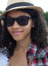
- It was clear that with some of the magazine adverts I researched, I discovered that many if not most use the same image and background from their album cover for the advertisement. I intend to replicate this technique myself in order to create a synergy between both products.
- I will use the same font used on the digipak. This makes the style recognisable to the audience, as well as using the same logo for the band.
- Something that I didn't manage to incorporate onto my digipak but wanted to originally was to use a speech bubble that would reflect the conventions of cartoons and comics, a theme running throughout the music video and digipak.
- Jamie T's advertisement did not seem too overpacked with images and was rather much more simplistic but effective. This is another technique I want to include on my own design.
- The information on these adverts was also quite sparse and so I wish to only include the release date, title and where it can be brought, as well as a website for the band.
Showing posts with label Research and Planning - Advertisement. Show all posts
Showing posts with label Research and Planning - Advertisement. Show all posts
Monday, 8 March 2010
Ideas for my own Advertisement
After looking at other magazine adverts such as Jamie T's Kings & Queens and Blur, I have come to some final decisions about my own magazine advert. These were:
Monday, 15 February 2010
Sunday, 14 February 2010
Conventions of an Advertisement
When researching a number of magazine adverts it was clear to see the conventions included in the design of almost all of the advertisements I found. I hope that the conventions I picked out will help to aid my own design in promoting my band's, "Amber Rhythm" own mag advertisement. These will be the most important features of my own design.
- Artist name and album title
- Release date
- Web address
- Product content - extra DVD footage, bonus tracks
- Magazine reviews/endorsements - NME, Q, Atmosphere etc.
- Name of Record Label
- Tour dates
- Images - photographs/graphics/combination
- Outlets in which available - HMV, Amazon
- Slogan/Tagline "Freedom to be who you want to be"
- Limited edition. Digipak/standard
- "Out now"/"debut album"
- Offers - free download if you sign up to ... website
- Stars *****
Ancillary Task Two - Magazine Advertisement
Our second Ancillary Task is to design a magazine advert for our digipak and so in order to prepare and research this task, I have looked at other examples of advertisements that will help me decide what to include in my own creation. My magazine advert and digipak need to demonstrate an correlating relationship. This is achieved through:
- Research - looking at designs, colours, images, font type, layout, mise-en-scene, texture used in other magazine adverts of the Pop/Rock genre.
- Using similar (if not identical) designs, colours, images, font type, layout, mise-en-scene, texture in your magazine cover as you have for my digipak.
- Being able to show links between my digipak and magazine advert with our music video.
- Making my digipak and magazine look as professional and realistic as possible.
When looking at these important aspects to include in my own magazine advert design, there are a few extra ideas that could be included to create a correlating relationship between the advertisement and digipak. These are:
- An image to act as a teaser for the audience.
- A colour scheme running throughout.
- Continuity of the font type.
- Connotations of the language.
- Intertextuality - Propoganda.
Subscribe to:
Posts (Atom)


