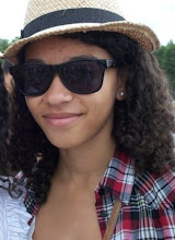
I used the Internet to search for images to incorporate onto my cover design and tried out different layouts. This was my first draft:
 As this was my first draft, I knew I would only be experimenting with the programme as well as my own ideas. The lettering of the album name I felt however was too jumbled on a second viewing although I was pleased with my placing of the band name, at the top, in large font making it distinguishable from the other text. I wasn't pleased with my image of the band's singer. I used the lasso tool to cut around the image and the final product showed the edges were rough. I thought this would add to the idea of the band's youthful audience in that the rough edges would appeal to teenagers themselves having a "rough edge".
The orange background has connotations with the band's name "amber", the amber colour symbolising to "get ready" at traffic lights. This could also suggest that the audience should "get ready" or prepare themselves for the band's debut album. The image of the band's singer I have used the cartoon effect for. This creates a synergy between itself and the music video of "Superman" due to the connotations of comic books.
I will however develop my ideas further in the coming days.

No comments:
Post a Comment